As a part of the Accenture North America Product Design Virtual Experience Program, We aimed at transforming the user’s experience by adding new features and iterating on an existing product screen.
Conducting user research to identify pain points and opportunities for improvement.
Designing and prototyping a new feature using Figma.
Iterating on an existing product screen to improve usability and aesthetics.
Communicating design rationale and decisions effectively to stakeholders.
The Problem
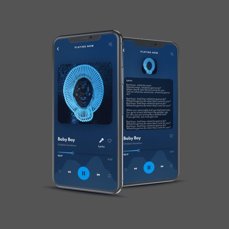
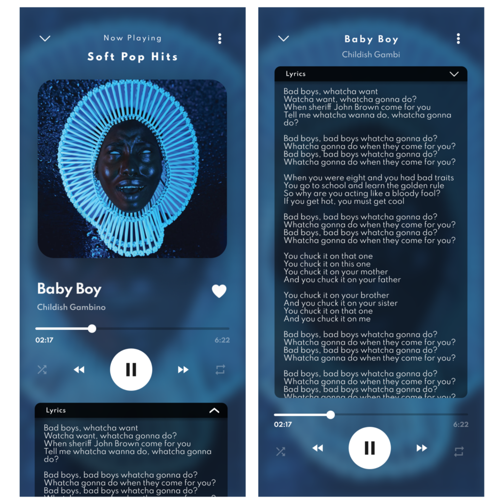
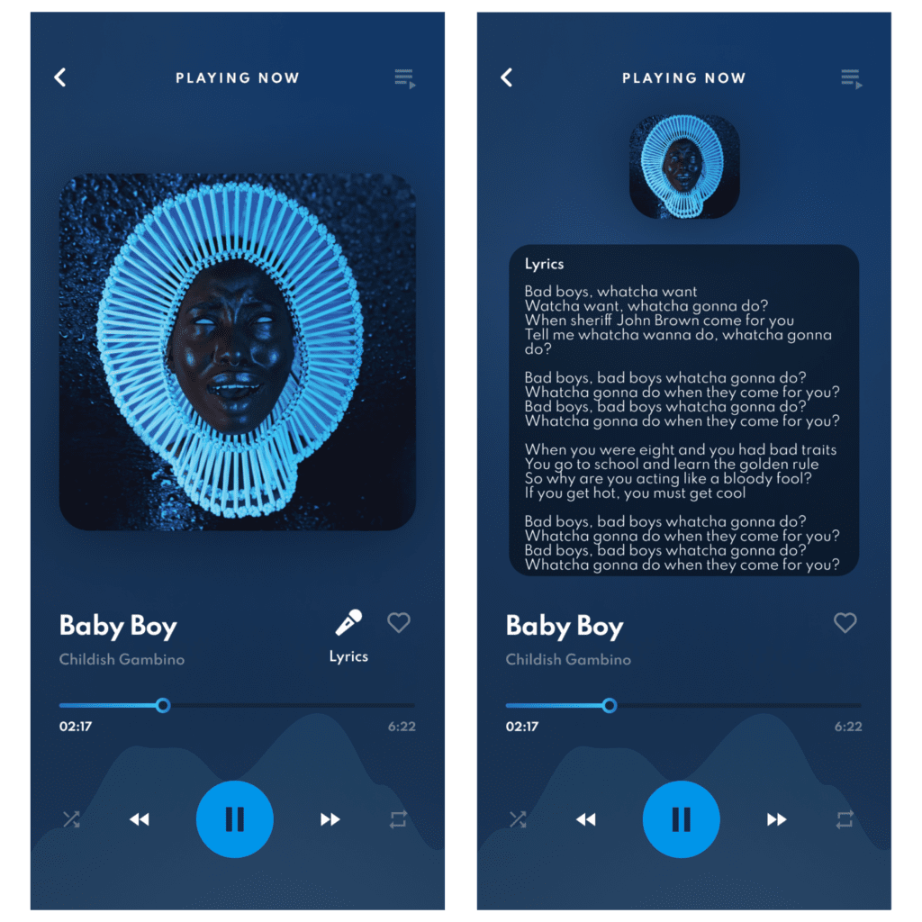
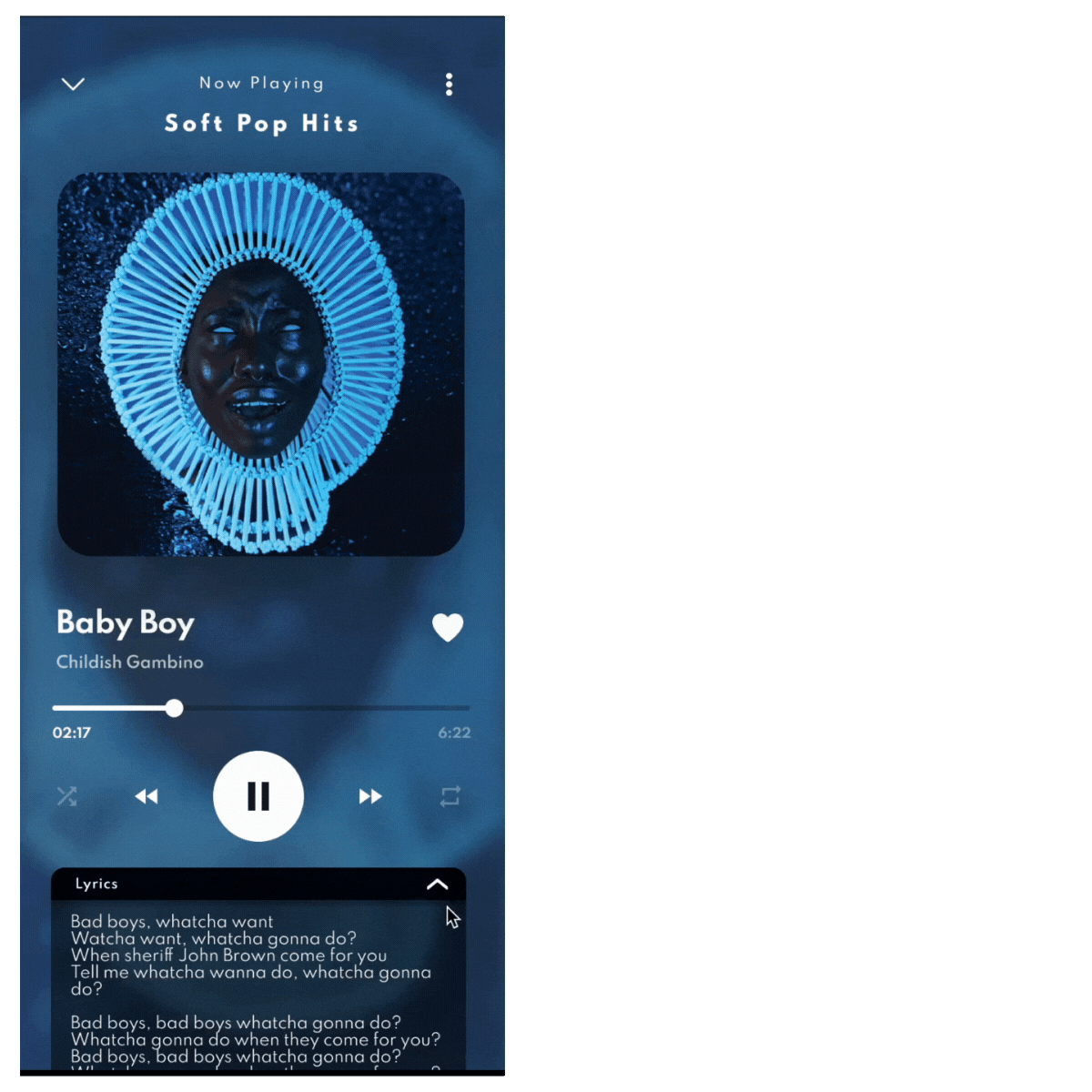
In our music app, users were frequently leaving the app to look up song lyrics on other websites. This was frustrating and broke their music experience. Our goal was to keep users engaged within our app by providing the lyrics directly alongside the music.
Target Audience
Our main users are music lovers, especially those aged 15-35. They enjoy singing along to their favorite songs and want an immersive experience. They need easy access to lyrics without having to leave the app.
Research and Insights
To address the problem, We conducted extensive research, including:
Competitive Analysis: Studied other music apps to see how they integrated lyrics and identified best practices.
Usability Testing: Observed user interactions with wireframes and prototypes to gather qualitative data and refine the design.
These research activities provided critical insights that shaped the design solution.
Design Process
The design process was iterative and collaborative, involving multiple stages of refinement:
Wireframing: I sketched out initial ideas to map the structure and flow of the new lyrics feature. This stage was essential for quick iterations and feedback.
Prototypes: Using Figma, I created high-fidelity prototypes to visualize the final design. My focus was on making the lyrics easy to read and perfectly synced with the music.
Iteration: Based on user feedback and usability testing, I made necessary adjustments to the design. This iterative process ensured that the final product was both user-friendly and aesthetically pleasing.
Communication: I documented and communicated my design decisions, providing clear rationale for each choice. This step was vital for aligning stakeholders and ensuring the design met business objectives.
Throughout the project, We encountered several challenges:
Balancing User Needs with Business Goals: Ensuring the design met user expectations while aligning with business objectives required careful consideration and compromise.
Time Constraints: Working within a limited timeframe necessitated efficient prioritization and decision-making.
Technical Feasibility: Ensuring that the design was technically feasible and could be implemented smoothly.
To overcome these challenges, We leveraged critical thinking and problem-solving skills, ensuring that each design decision was well-informed and strategically sound.
Outcomes and Impact
The project culminated in a refined product screen with an added feature that significantly enhanced the user experience. Key outcomes included:
Improved Usability: The new feature streamlined user interactions, reducing friction and improving overall satisfaction.
Enhanced Aesthetics: Iterations on the existing screen resulted in a more visually appealing and cohesive design.
Positive Feedback: User testing and feedback indicated a high level of satisfaction with the new design, validating the effectiveness of the improvements.