Healing House Hub
United Kingdom
February 2025 – Present
The Healing House Hub logo embodies the mission of providing care, support, and shelter. Designed with a focus on security and healing, this case study explores the creative journey behind the logo’s development from concept to final execution.
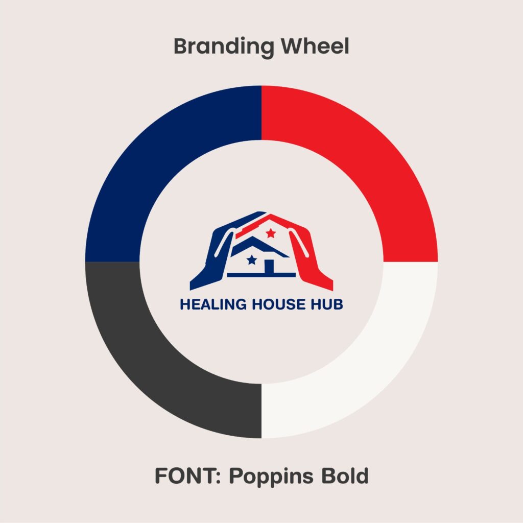
The core idea behind the logo was to visually represent protection, healing, and unity. The brand name suggests a place where individuals receive support, making the imagery of a house and hands an ideal representation. The color scheme and symbols further emphasize care and trust.

Symbolism:
Stars:
Typography:
Color Palette:


Throughout the design process, multiple versions were explored, adjusting the placement of hands, the style of the house, and the typography to achieve the perfect balance between professionalism, warmth, and recognition.
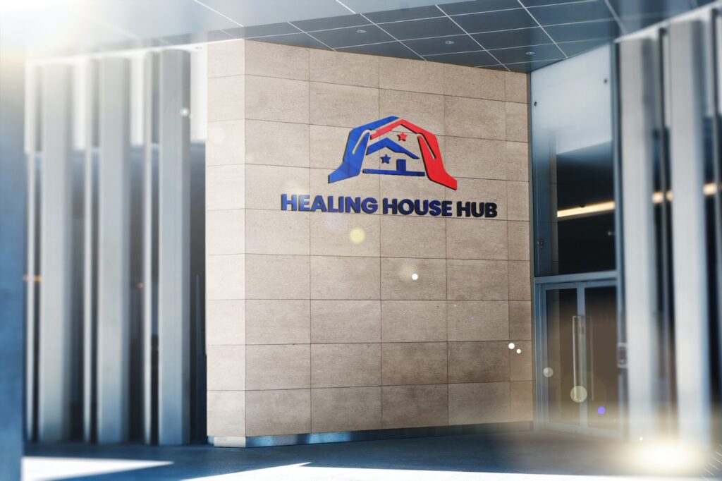
The finalized logo effectively captures the mission of Healing House Hub, making it memorable, meaningful, and versatile. It works well across various platforms, from websites to business cards and promotional materials.

The Healing House Hub logo serves as a powerful visual identity, reinforcing the values of care, protection, and trust. Through thoughtful design, it conveys a message of safety and community, strengthening the organization’s presence and purpose.

Schedule Your Free Consultation Today
Peonixis Ltd is a company registered in England & Wales with Company Number 15904214
Location:
19090 182-184 High Street North, East Ham, London, England, E6 2JA
Phone:
+44 20 3432 3787
WhatsApp:
+44 74 9412 5861